As technology develops across a variety of different platforms and devices, the nature and design of the webpage has massively changed. The clutter of yesteryear is being replaced by slick HTML5 designs which are evermore mobile friendly. More and more of us are accessing the net solely through mobile phones, which means sites need to be adaptable to the small screen medium.
Compartmentalized, clean, navigable sites are essential for the success of the mobile revolution, and in this article we’ll look at five of the best mobile sites.
Wikipedia
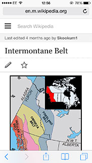
 Wikipedia is the prime example of a detail heavy site which has been successfully restructured and streamlined for mobile phones. When you’re viewing a site on a laptop, the only user requirement is that you scroll up or down. The mobile site allows for the same kind of navigation technique, but it has been narrowed down completely. All of the subsections are built into easy to control tabs, thereby trimming the fat, whilst still retaining all of the information. Importantly, you never feel like you have to rummage around or skip screens.
.
.
.
Ladbrokes
 Gambling sites were presented with the same problem as Wikipedia; there was a huge array of information in the form of endless sporting events and betting markets which needed to be findable and compartmentalized. Ladbrokes have done this superbly, with aesthetically pleasing icons and interactive sub-sections.
.
.
.
.
.
.
John Lewis
 Making it simple for visitors to locate their products, John Lewis have an easy to use interface with categories shown on the homepage instantly. The product pages are simplified but still offer enough detail to allow shoppers to make their buying decision. Retail companies need to ensure their websites are accessible on mobile devices due to the consistent increase in mobile shoppers.
.
.
.
.
.
 A special mention in this top five needs to go to Facebook, and their site which has been specially adapted for emerging markets: Facebook Zero. Data and download speeds are a huge dilemma in emerging economies, so Facebook jumped this hurdle by delivering a stripped down, functional site which would secure a whole new audience. Mobile internet is the only form of internet in many countries, and finding ways to reach this market have to be innovative.
.
.
.
.
.
eBay
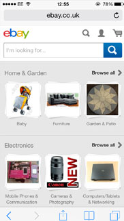
 As a site which defined the early stages of the internet, eBay turned out that the mobile incarnation of the site is now often deemed to be more useful than the ordinary version. Some shopping sites have a heck of a lot of clutter, and when they’re presented in their rawest form, they can be a real breath of fresh air. There’s plenty of evidence to say that people don’t like making transactions on small screens, so sites like eBay did incredibly well to meet one of their most pressing challenges.
Every product should be designed to be as economical as possible, maintaining the core message without any unnecessary distractions. HTML5 aids this style of design, and you can expect our favorite sites to get better and more digestible in the coming years when designers begin to craft sites with tablets and phones in mind rather than PCs and laptops.
