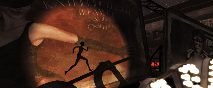
It’s tempting for a Contrast game review to focus on shadows as a gameplay mechanic, but the references throughout the puzzle platformer go far deeper than that. From its plot and characters to its level design, Contrast uses the difference between light and shadow — and between upstanding and shadowy people — to immerse players in a story unlike any platformer to date. That its gameplay is so original would be mere gravy if it weren’t such an asset to the finished product.
Contrast was one of the first indie games shown on Xbox One, and its release was part of the first wave of ID@Xbox titles. There was surely a hefty bit of pressure with those credentials, but the team at Compulsion Games handled it with aplomb. In fact, they may have made a mess of enemies in the process, as Contrast set the bar ridiculously high for all future ID@Xbox titles. (Contrast is also available on PS4, Xbox 360, PS3 and Steam.)
Contrast tells the story of a girl named Didi, whose jazz-club singer mother has separated from her father. As any little girl is wont to do, Didi wants to see her parents get back together and wanders the city doing secretive errands in an attempt to help make things right.
The problem with being a little girl in a large 1920s city is, well, the fact that Didi’s little. That’s where her “imaginary friend” comes into play. Players control Dawn through the game by following Didi and jumping from platform to platform to complete various tasks. Some areas are inaccessible, though, leaving players to use Dawn’s ability to enter the world of shadows and jump on/from the shadows of other objects to solve environmental puzzles.
Several levels let players move light sources and/or objects to create new shadows, thus creating their own platforms. These instances generally work pretty well, though the final level’s light source is borderline sadistic in terms of getting it to line up just right to create the perfect path.
Most of the game creates the shadows for the player, who must use traditional platforming skills and precise timing to navigate the level. No level is comprised completely of shadows; in fact most levels are spent jumping through the “real” world, with only a half-dozen or so areas requiring Dawn to become her shadowy self. Yet as excellent as the game’s full slate of platforming may be, it’s the shadow elements that steal the show. Something as simple as the shadows cast by a bicycle or a carousel create platforming opportunities that you’ve never seen — let alone considered — ever before.
In many cases the shadows act as a literal backdrop for the level, though in some cases they help move the story along. Other than Didi and Dawn, no character is seen in any form other than silhouette. This gives Contrast a bit of a noir feel and seamlessly intertwines the plot and gameplay. Full expositional scenes play out in what appears to be the background, only for players to then realize that they need to use those shadows to access new areas of the level. It’s an ingenious bit of level design and the most innovative connection between storytelling and gameplay since the interactive cut scene. You’ve never seen anything like this before.
With such deliberate gameplay consequences, the plot playing-out before you can’t be ignored. Fortunately you wouldn’t want to ignore it anyway, as the story and character developments are incredibly compelling. Each character has a distinct personality and story arc, and the twist Compulsion Games throws in at the end is completely unexpected. Like the end of BioShock Infinite, Contrast leaves you wanting more as soon as the end credits roll, but not in a bad way.
In spite of its mostly muted color palette — the game takes place almost exclusively at night — the 1920s-era city in Contrast provides plenty of opportunity for accent colors. The art direction also gives way to some clever architecture that frames the shadowy expositional scenes without leaving you feeling slighted for seeing so many things in black and white.
I’ve also got to give serious kudos to the Compulsion Games music department. The jazz-infused soundtrack is completely appropriate for the era and could not have been executed better. Considering there are only 16 tracks for the game, each of which is about 60 seconds long, it’s remarkable that the background music never seems repetitive. Even more remarkable are the two vocal tracks by Laura Ellis. Listen to them on Spotify and tell me you’re not astounded. I dare you.
For anyone who thinks the Xbox One is just for shooters, or that platforming in general is getting tired, Contrast is a must-play game. Compulsion Games knocked this one out of the park; I can think of only two times in the entire experience — one tied to platforming and one that seemed to be a bug — that were less than impressive. I can without hesitation recommend Contrast to anyone who’s even remotely interested. It’s truly one of the few gems to release so far in 2013.
Score: 9.3
Platform reviewed: Xbox One

