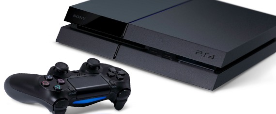
The PlayStation 4 is a gorgeous bit of hardware. Anyone who says otherwise is either dumb or in denial. When the system launches on Nov. 15, in fact, the PS4 hardware bound to be placed front and center on owners’ entertainment systems, because it’s just that sexy. The Xbox One, on the other hand, may be powerful and have some sweet entertainment functionality, but its VCR-like design frankly leaves much to be desired.
Today the PlayStation Blog ran a great interview with the PS4 hardware designer, Tetsu Sumii. While a lot of the attention since E3 has gone to sold-out launch units and processing power, the discussion about hardware design hasn’t been covered much until now. Frankly, I think it’s just because Sony and Microsoft haven’t wanted to talk about it, but that’s an article for a different day. Today, finally, we get to hear more about the hardware design itself.
The original interview contains more media than we have here, so if you want to see more pretty pictures we recommend that you head over there. However, if you’re just into the raw info about the PS4 hardware design straight from the horse’s mouth, we’ve copied/pasted the interview here.
“When we started the product design for PS4, we didn’t start by thinking about what the shape would be. It was more about how we were going to create a new brand identity through the product,” he explains. Without offering details, Sumii tantalisingly admits that his first concept was “totally different” to how PS4 has eventually ended up. That said, his core philosophy for what the PS4 should be remained consistent, and is clearly evident in the bold, striking lines and contours of the final design.
“I just wanted to make a simple object for the living room. Sometimes products are a little too exaggerated. It should be simple. That’s my thinking,” he states.
Moreover, Sumii explains that he put emphasis on ensuring the machine looked good from every angle, whether gamers chose to display it flat on its belly, or upright in its stand.
“I think about the horizontal, not just the vertical,” he says. “I think about the 360 degree view. The reverse should be beautiful, too.”
While PlayStation heritage certainly wasn’t thrown out the window (veteran PlayStation gamers might be able to spot some PS2 DNA in PS4’s look), it’s a brand new hardware generation, and accordingly warranted a fresh approach. Sumii, who joined the project from Sony’s mobile phone division and is a newcomer to console design, brought a new perspective with him.
“One of my tasks is to create one single PlayStation identity. I wasn’t just thinking about the console but also about the DualShock 4, the DualShock 4 Charging Station, the Vertical Stand, the Mono headset, PS Vita — everything,” says Sumii.
“I think the PlayStation brand image needs to be changed a little bit, as it’s a new console, and we have to show what we’re pointing towards for the future. So I thought it should be one of the most smart, cool, and intelligent products from Sony. Not just from Sony Computer Entertainment, but the company as a whole.
“This should be one of the best, coolest, most sophisticated products we’ve created. That’s what we were striving for,” he reiterates.
Handling the striking, compact PS4 hardware immediately after our brief conversation, it’s hard to disagree that he’s pulled it off. And with launch now less than two months away, it’s not long until you’ll get to decide for yourself.

